This section covers the MessageDialog, ChooseDialog, AskDialog, InputDialog, TickerDialog, ColorDialog, and TextureDialog objects of the vizdlg module. All dialog boxes create a Panel with accept/cancel buttons. By default their visibility is turned off unless added to a TabPanel. A show method is provided to display the dialog and wait for a button event.
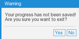
A MessageDialog creates a dialog that displays a message to the user. The following code displays a yes/no question to the user:
The following command creates a MessageDialog object:
|
Command |
Description |
|
vizdlg.MessageDialog(message, **kw) |
Creates a MessageDialog object.
The message that will display within the box.
**kw refers to any arguments the Dialog/Panel base classes accept. |
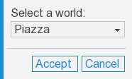
A ChooseDialog displays a drop list of options for the user to choose from. The following code displays a dialog that allows the user to choose from a list of worlds:
The following command creates a ChooseDialog object:
|
Command |
Description |
|
vizdlg.ChooseDialog(prompt=None, choices=[], selection=0, **kw) |
Creates a ChooseDialog object.
The prompt argument will display above the drop list. Can be None to hide the prompt.
The choices argument specifies the list of option strings to display in the drop list.
The selection argument specifies the index of the initially selected option.
**kw refers to any arguments the Dialog/Panel base classes accept. |
The following variable stores the value of the ChooseDialog:
|
Attribute |
Description |
|
<ChooseDialog>.selection |
Contains the index of the currently selected option. |
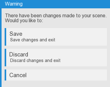
An AskDialog displays multiple options to the user as buttons. The following code gives the user the option to save, discard, or cancel:
The following command creates an AskDialog object:
|
Command |
Description |
|
vizdlg.AskDialog(prompt=None, options=[], **kw) |
Creates an AskDialog object.
The prompt argument will display above the list of options. Can be None to hide the prompt.
The options argument specifies the list of option strings to display as individual buttons. If the item is a tuple of two strings, then the first string will be the title of the button and the second string will be displayed as a smaller description below the title.
**kw refers to any arguments the Dialog/Panel base classes accept. |
The following variable stores the value of the AskDialog:
|
Attribute |
Description |
|
<AskDialog>.selection |
Contains the index of the selected option. |
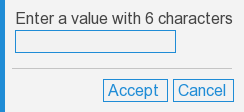
An InputDialog creates a dialog with a textbox that allows the user to type in a value. The following code shows the dialog object and validates the user's entry:
The following command creates an InputDialog object:
|
Command |
Description |
|
vizdlg.InputDialog(prompt=None, value='', length=1.0, validate=None, **kw) |
Creates an InputDialog object.
The prompt argument will display above the textbox.
The value argument sets the initial textbox value.
The length argument sets the length of the textbox.
You can optionally specify a function to validate the entry using the validate argument.
**kw refers to any arguments the Dialog/Panel base classes accept. |
The following variable stores the value of the InputDialog:
|
Attribute |
Description |
|
<InputDialog>.value |
A variable that holds the current string value of the dialog. |
Take a look at the Methods section to see methods common to all dialog objects.
If a validate function is specified it will be called once the textbox has lost focus. It will be passed a viz.Data object with the following fields:
|
Field |
Description |
|
<viz.Data>.value |
The value currently in the textbox. |
|
<viz.Data>.oldValue |
Either the initial value or the last valid entry. |
The function should return True or False depending on whether the value is valid or invalid. If True is returned then the value in the textbox will remain. Otherwise, if False is returned, an error message will be displayed. A custom error message can be specified using the following field of the viz.Data object:
|
Field |
Description |
|
<viz.Data>.error |
A string that contains a custom error message. This will be displayed if the validate function returns a value of False. |
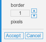
A TickerDialog creates a dialog with a textbox and up/down buttons that allow the user to select between a range of integer or floating point values. The following example shows the dialog object and prints out the value displayed in the textbox once the accept button is pressed:
The following command creates a TickerDialog:
|
Command |
Description |
|
vizdlg.TickerDialog(label='', units='', range=(0,5,1), value=None, format=None, editable=True, **kw) |
Creates a TickerDialog.
The label argument will appear above the textbox.
The units argument will appear below the textbox.
The list passed into the range argument defines the low and high values and the interval to use.
To set the initial value of the dialog use the value argument. By default, it will be set to the low value of the range.
By default the value shown in the textbox will be formatted to display an integer if the range interval is an integer and a float with two decimal places if the range interval is a float. Use the string formatting(%) operator in the format argument to change this. (e.g. for a float with 1 decimal place use: '%.1f'.
When editable is set to True the user can type a value into the texbox directly.
**kw refers to any arguments the Dialog/Panel base classes accept. |
The following variable stores the value of the TickerDialog:
|
Attribute |
Description |
|
<TickerDialog>.value |
A variable that holds the current value of the dialog. This is either an integer or float. |
Take a look at the Methods section to see methods common to all dialog objects.
A ColorDialog creates three textboxes for inputting RGB values and a quad that displays the resulting color.
The folllowing example creates a ColorDialog and applies the dialog color to a ball in the scene when the accept button is pressed:
The following command creates a ColorDialog object:
|
Command |
Description |
|
vizdlg.ColorDialog(value=[0,0,0],**kw) |
Creates a ColorDialog.
The value argument sets the initial RGB values of the dialog.
**kw refers to any arguments the Dialog/Panel base classes accept. |
The following variable stores the value of the ColorDialog:
|
Attribute |
Description |
|
<ColorDialog>.value |
A variable that holds the current value of the dialog. This is a list of 3 integers representing an RGB value. |
Take a look at the Methods section to see methods common to all dialog objects.
A TextureDialog allows the user to select from a group of textures.
The following example adds a TextureDialog and allows the user to select between two textures. When the accept button is pressed the selected texture is applied to a texture quad in the scene:
The following creates a TextureDialog object:
|
Command |
Description |
|
vizdlg.TextureDialog(value=None, options=[], iconSize=50, selectSize=5, columns=4, **kw) |
Creates a TextureDialog.
The value argument sets which texture is initially selected.
The options argument is a list of textures to display and select from.
The iconSize argument specifies the dimensions of the texture icon, in pixels.
The selectSize argument specifies the width of the border that appears around a selected icon, in pixels.
The columns argument specifies how many columns are used to display the textures.
**kw refers to any arguments the Dialog/Panel base classes accept. |
The following variable stores the value of the TextureDialog:
|
Attribute |
Description |
|
<TextureDialog>.value |
A variable that holds the current value of the dialog. This is an integer that represents the index position of the selected texture in the texture list. |
Take a look at the Methods section to see methods common to all dialog objects.
The following methods are common to all dialog objects:
|
Method |
Description |
|
<Dialog>.__init__(title=None, align=viz.ALIGN_CENTER, accept='Accept', cancel='Cancel', acceptKey=viz.KEY_RETURN, cancelKey=viz.KEY_ESCAPE, **kw) |
Initializes the base Dialog class.
title is option title bar to add to the dialog.
align specifies how to align the content of the dialog.
accept specifies the string to display within the accept button.
cancel species the string to display within the cancel button. Can be None to hide the cancel button.
acceptKey specifies a key to allow for accepting the dialog. Can be None to prevent any keys from accepting the dialog.
cancelKey specifies a key to allow for canceling the dialog. Can be None to prevent any keys from canceling the dialog.
**kw refers to any arguments the Panel base classe accepts. |
|
<Dialog>.show() |
Makes the dialog visible, waits for either the accept/cancel button to be pressed, then hides the dialog. If the accept button was pressed then the <Dialog>.accepted variable will be set to True.
Note: This method must be called within a viztask function after a yield statement. |
|
<Dialog>.remove() |
Removes the dialog. |
| <Dialog>.doAccept() | Can be used while the dialog is displayed to simulate the accept button being pressed. |
| <Dialog>.doCancel() | Can be used while the dialog is displayed to simulate the cancel button begin pressed. |
| <Dialog>.onAccept() | Can be overridden by derived classes to execute code when the accept action is taken. Return True to allow the accept action to proceed. |
| <Dialog>.onCancel() | Can be overridden by derived classes to execute code when the cancel action is taken. Return True to allow the cancel action to proceed. |
| <Dialog>.onShow() | Can be overridden by derived classes to execute code when the dialog is about to be displayed. |
| <Dialog>.onClose() | Can be overridden by derived classes to execute code when the dialog is about to be closed. |
The following attributes are common to all dialog objects:
|
Attribute |
Description |
|
<Dialog>.accepted |
Boolean value that is created in the show method after a button is pressed. This will be set to True if the accept button is pressed and False if the cancel button is pressed. |
|
<Dialog>.accept |
Button object with Accept label. |
|
<Dialog>.cancel |
Button object with Cancel label. |
When using dialog components in a TabPanel the dialog's visibility will be turned on by default. Instead of using the show method, button events can be handled directly.
The following example adds two dialogs to a TabPanel and handles button events for each: