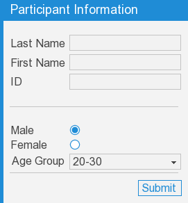
Use the vizinfo library to group GUI elements in a panel. It supports lists and custom layouts of elements. Other features include:
Use the <InfoPanel>.addLabelItem() method to add a GUI element and label that are aligned to the left side of the panel. Use the <InfoPanel>.addItem() to add a GUI element without a label and custom alignment. The elements are added to the panel from top to bottom:

In addition to GUI elements, info panels display most node3D objects:
Custom layouts of GUI elements can be created by nesting vizdlg.Panel objects within the main vizinfo panel. In the following example a vizdlg panel with a horizontal layout is used to place three checkboxes side by side:
If no text is specified when adding the info panel, the doc string of the main module is displayed. This is a handy way to both comment the script and display information to the user when it is running:
Set the fontSize in the info panel constructor to change the main text and title text size. This does not affect the size of text and GUI elements in the body of the panel:
Set the fontSize of the title bar to change the title text size. This does not affect the size of the main text:
Set the fontSize of the underlying panel to change the size of text and GUI elements in the body of the info panel:
The following command creates an InfoPanel object:
|
Command |
Description |
|
vizinfo.InfoPanel(text=MainDocString, align=viz.ALIGN_LEFT_TOP, margin=(15.0,15.0), key=viz.KEY_F1, icon=True, fontSize=18, window=viz.MainWindow) title=None) |
Creates an InfoPanel object.
text: Sets the text of the info panel. If nothing is specified and the script contains a main docstring (top of the script), the docstring text will be used. align: Sets the alignment mode of the info panel. See the table below for alignment options. margin: Sets the [x,y] distance of the info panel from the screen edge in pixel units. key: Sets the key to toggle the visibility of the info panel. icon: Sets the visibility of the icon. fontSize: Sets the size of text and GUI elements window: Specifies the window that the panel is attached to title: Sets the text of the title bar. |
The following methods are available on the InfoPanel object:
|
Method |
Description |
|
<InfoPanel>.getTextNode() |
Gets the underlying text node object. |
|
<InfoPanel>.getPanel() |
Gets the underlying vizdlg.Panel object. |
|
<InfoPanel>.addItem(item, align=None, visible=True, insert=None, fontSize=None) |
item: A GUI element, texture quad, or other node3D object. align: See the table below for align modes. insert:Determines the item's order placement on the panel. A value of 0 means the item will be the first one added to the panel. If no value is given the item is added after all other items. fontSize:Determines the size of the item. If no value is given the panel fontSize value is used. |
|
<InfoPanel>.addSeparator( ratio=0.9, padding=(0,5) |
Draws a horizontal line across the panel. ratio: argument defines the line length to panel length ratio. If the value is one, the line is drawn all the way across the panel. padding: defines the spacing in pixels above and below the line. |
|
<InfoPanel>.addLabelItem( name, item) |
name: text label placed to the left of the item item: A GUI element, texture quad, or other node3D object. |
|
<InfoPanel>.setPanelVisible( mode, animate=True) |
mode: Can be viz.ON, viz.OFF, or viz.TOGGLE |
|
<InfoPanel>.getPanelVisible() |
Gets the visibility of the panel. |
|
<InfoPanel>.setAnimation(animation) |
Custom animations for toggling the panel's visibility can be created by extending the vizinfo.InfoAnimation class. |
|
<InfoPanel>.getAnimation() |
Gets the animation for toggling the visibility of the panel |
|
<InfoPanel>.setText(text) |
Sets the text of the info panel. |
|
<InfoPanel>.getText() |
Gets the text of the info panel. |
| <InfoPanel>.setTitle(title) | Sets the title text of the info panel. Use None to remove the title bar. |
| <InfoPanel>.getTitle() | Gets the title text of the info panel, or None if no title bar is assigned. |
| <InfoPanel>.getTitleBar() | Returns the underlying vizdlg.TitleBar object, or None if no title bar is assigned. |
|
<InfoPanel>.setAlignment(align) |
Sets the alignment mode of the info panel. See the table below for alignment options. |
|
<InfoPanel>.getAlignment() |
Gets the alignment mode of the info panel. |
|
<InfoPanel>.setMargin(margin) |
Sets the [x,y] distance of the info panel from the screen edge in pixel units. |
|
<InfoPanel>.getMargin() |
Gets the [x,y] distance of the info panel from the screen edge in pixel units. |
|
<InfoPanel>.setToggleKey(key) |
Sets the key to toggle the visibility of the info panel. |
|
<InfoPanel>.getToggleKey |
Gets the key that toggles the visibility of the info panel. |
|
<InfoPanel>.getIcon() |
Gets the icon node object. |
|
<InfoPanel>.setIconTexture(texture) |
Sets the texture for the icon. |
The following alignment modes are available:
|
Alignment |
|
viz.ALIGN_LEFT_TOP |
|
viz.ALIGN_RIGHT_TOP |
|
viz.ALIGN_LEFT_BOTTOM |
|
viz.ALIGN_RIGHT_BOTTOM |
|
viz.ALIGN_CENTER |
|
viz.ALIGN_LEFT_CENTER |
|
viz.ALIGN_RIGHT_CENTER |
|
viz.ALIGN_CENTER_TOP |
|
viz.ALIGN_CENTER_BOTTOM |
Getting data from GUI elements